Monday, January 11, 2016

Premade Covers 2

So I found these very lovely legal pics (one of a girl and the other of a close-up violet) and decided they were destined to go together. One of the flower meanings for a violet is "daydreams". I used "Vladimir Script" for the title and "Poor Richard" for the Author Name. Finally, a bit of Tranquil filter for the overall pic. The Title actually has two white overlays in Bold to give that glow. It looked a little bare so I put a bit of PicMonkey garnish on top. The violet pic, I put on the girl pic as a layer and just carved away the parts I didn't need. If you have Photoshop Skills I bet you can carve it out quicker but even if you don't, now you know it can be done.


I found this girl (legal pic) who had this Eastern Caravan look so I thought I'd do some kind of caravan thing with camels (legal pic). I used FotoFlexer to cut the girl out of the black background she came with and used the "Add layer" effect in FotoFlexer to paste her on top of the camels. Since the sizing was awkward it took a few tries to get it just right. I used "Calamity Jane NF" for "Dreaming" and "Caravan". For the "of the" and the Author Name I used "Annie Use Your Telescope". There are also a bunch of filters to make the girl and the background blend together a bit more.


I found this legal pic of a feather with a white background and decided to make a simplistic cover. This one is different from the others in that I only used PicMonkey to resize and crop the cover. I used fonts from iPiccy as well as color effects and the overlay effect of the sky. The boarder is also iPiccy. If you have never messed with iPiccy it is a cool photo-editing site with awesome overlay effects. You can also make your fonts squished looking or give it stripes or circular designs. The boarders are awesome as well. However, if you want a large variety of font choices, and if that is what you primarily look for in a photo-editing site, then iPiccy may not be for you. They do have awesome fonts but not as large a choice as, say, PicMonkey. With PicMonkey you can link your own fonts to the site and use them so the choices are limitless.


Finally, my horror/Harry-Potter-vibe/goth-vibe one. The Barn Owl I cut out using FotoFlexer from another legal photo. Barn Owls are also called Ghost Owls, Death Owls and many more. You might be surprised to know that "Death Owl Manor" font is called "Mountains of Christmas". Author name is "New Yorker". I tried to blend the background and the owl using a bunch of filters. Idk what can come out of this premade cover but perhaps someone can have fun with it. Barn Owls are freaky things. They do this thing called "silent flight" where they fly without a sound and then BAM! attack their prey. Their screech is also apparently very eerie.

Premade Covers 1


This one, I just added the Title and Author Name design. I wanted it to have a sort of urban, city look so I chose Agency FB. If you don't know what that is, go to Font 1001 website and check it out. I thought it was perfect for the urban feel. I probably could have made the overall pic a little brighter, but it seemed fine the way it was. Urban, slightly sad or melancholy. Maybe even longing. If anyone wants this pic, it'll be exciting to see what story might go behind it :)


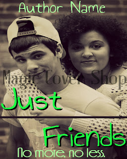
Okay, so I had this (legal) pic in my legal pic file for quite sometime. I originally downloaded it for one of my requests in Magic Cover Shop on Figment. But I found a better one and decided not to use this. It's a nice pic, just I had no idea what to do with it, you know? These people, in my opinion, didn't look like a couple. More like friends. Hence the title "Just Friends" and the subtitle "No more, no less." Perhaps someone can wield a story about two very good male and female friends who each have their own love interests outside their friendship. But in the end, the friendship never dies. Kind of like the happy-ending version of the Friend Zone, I suppose. The reason, the fonts are green...I had spring in mind.


I actually really like how this came out. I'm not gonna lie. You might be able to see that the frosted tree branches fade out in the background. Actually, it's an overlay on top of the one in the "front", or more clearer version. It just appeared very nicely in the back without being so visible on the original pic. So I flipped it and faded it so that it looked as natural as possible, adding depth to the cover. The word "Frostbite" has both a gray title and a light blue title. "Dusk" has a very light orange title and a gray title. "at" is just black faded. The Author Name is "Friandise NormalDemo" black and faded and the Title is "Poor Richard" also faded and overlayed...it might have been lightened...I don't really remember since I did make these a while back. The banners behind are both white faded. I also put a lot of filters on the original pic (legal). Some Cross Process and I think I put some black and white fade on it. If you use PicMonkey, you know what I'm talking about. I think I also added a teeny bit of Dusk effect, as well. Idk what you can get out of this but maybe someone can get something out of it.