(Important note: None of these covers are legal. I only take credit for the creativity.)
But I knew the original pic, the girl, could be used in a better way. And I hope this is better... I tried my best, guys, I really did but the girl is standing in such an awkward position. Here's the original pic:
 |
| Relax your shoulders, they're too tense! |
Okay, so here's the reusing of the pic hopefully to its full potential.
Do you think I made it work? Or does it still look awkward?
And tell me, if both the bad cover and good cover were actual covers for actual books, which ones would you want to read?
Okay so this next pic, I really liked it but it was a strange long shaped rectangle that was hard to resize nicely. So I did the sneaky trick of adding frames.
Now...
ugh...nothing about this is good.The awkward name placement, the awkward title placement, the awkward subtitle placement...idk what I was thinking. Not to mention the fact I did nothing to the original pic.
 |
| The original pic. So skinny and hard to work with. Why did I choose you...not-pikachu? |
This pic is definitely not used to its full potential.
And so I made this one. I actually used the snowflake thing you see there as a background and overlayed the witchy-looking woman. That way the sizing doesn't look awkward. I'm not entirely satisfied with the color of the font though. I tried making it white or a lighter color or a different dark color but it wasn't working. Idk. What do you guys think?
And tell me, if both the bad cover and good cover were actual covers for actual books, which ones would you want to read?
(I repeat myself. Just in casey junior :P )
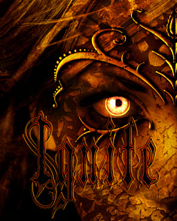
This last cover was also for a game...contest thing. It was to use one word and make three different covers. I chose "Mine" for some reason or maybe I was assigned it, I don't remember. Even though the idea of this split cover trick thing is creative on my part, if I do say so myself, the left half is not used to its full potential. Idk, it just looks weird.
 |
| You can see my pen name on top there. I thought it was a not-so popular name but... apparently there are a bunch of people using "Naomi" on Figment. |
Now...I would like to say that I only enhanced the original color of this pic. I added a fiery explosion overlay and added some flame-like color to the eyes. The font says "Ignite" if you couldn't tell. Though I like how it all came out, I feel like the font is hard to see and I'm not completely satisfied with this.
This is the original pic. Again, the awkward sizing that is very bad for making covers that are 400x500.
And tell me, if both the bad cover and good cover were actual covers for actual books, which ones would you want to read?
(I repeat myself for the last time. Just in case closed :P )
What did I learn from this? Well, I learned that not all pics you see out there on the Internet can be used for covermaking because they are just soooo awkward to begin with. So yeah, choose your pics wisely :)
See ya later, alligators :P


No comments:
Post a Comment