Monday, November 28, 2016

IMPORTANT: About Copyright Stuffs (Pixabay and other)

This is an important notice. I have been reading up on various copyright rules of Pixabay (where I get most of my legal pics) and decided to make this post.

Unless I explicitly state that the photo is my own original photo, you can assume that the other photos are not original. Typically what I do when making a photo-edit (is what I call them), is gather a bunch of good-looking legal photos from Pixabay or from Google Image ("insert random word here" wallpaper) and put them on top of each other.

Basically what I do is carve the photos and mash them into each other using cut-out, overlay, and collage techniques. In a sense, you can say that the editing is owned by me. I made the wonderful pic look epic. Get it? Epic? :P  And...the pun has been lost.

Some photo-edits I did and posted in my main blog "World Problems and Randomness" are not legal, meaning that I am messing with pics that other people have a rights to claim.  These I cannot sell and will not sell, don't worry :)

From now on I will make sure to let you know what exactly my photos are made of just so that I don't get fined. Of course you can say that lots of people are messing around with other people's photos without their consent and posting them on their blogs without their consent so what's the biggy deal?

But the thing is, it's always good to be kind to others by not claiming an entire photo as your own if the original was someone else's. I wouldn't want someone doing that to my photos so why would I do it to them?

Statements for Each Case

In the cases where I have used an original photo to make a photo-edit, these are copyrighted by me.

In the cases where I have used an original photo AND a photo that is not my own from some random person, I will post the original photo of mine so you can see what parts are of my photo.

In the cases where I have used some random person's photo, not under creative commons, don't worry, I won't sell these or even claim them as my own.

In the cases where I have used some landscape photos or photos of objects from Pixabay, and I am not selling them, I will not say anything because Pixabay says it is okay.

In the cases where I have used some landscape photos or photos of objects from Pixabay, and I AM SELLING THEM, I will say something, of course, and also ask the owner of the photo if they will mind it or not.

Finally, of course, if I'm selling any photo-edits using pics from Pixabay, I will ask the owner if it is okay or not.

End of Statements for Each Case


Pixabay has this thing about identifiable people and buildings may be protected so it might not be good to claim anything about them without asking the original owners. This gets tricky because who are these "identifiable people"? What if I don't know them?

With this case, I'll just have to ask the original owner IF I am selling them.

If not, I'll just say
it's from Pixabay.

That rhymed :)
My shop logo which I use for covers posted to this blog.
This is made by an amazing Figgy a.k.a The One and Only (Tony).

Tuesday, September 13, 2016

Seven Gardens not Seven Seas

When you think about pirates, you might think about the Seven Seas. This cover plays on that idea of the Seven Seas but this one is the Seven Gardens. The background is a mash up of four different parts. Can you tell? They are...

Covers I have made in MCS: Enjoy! :D


2016 COPYRIGHTED N.J. FOLETTIA @ Magic Cover Shop: Figment.

(the edited pics, the collage is copyrighted by me but the pics are either from random Google Image searches or from Pixabay. I have made sure that these covers will not be used commercially and be confined to Figment use only.)

Okay, these are all the covers I have made for people on Figment. Some are legal, some are not, well, that's kinda how it goes in Figment's Cover Studio. This isn't all of them, actually. Before I had MCS, I was already making covers for people for free. But...they weren't very good and a lot of them were just words on top of pictures.

Some of these might fool you cuz they do look like I just put fancy words on top of pictures but only about 7 of them are like that and out of those 7, about four or five of them had a bit of color editing done to the picture. Sometimes a cover can take ten-fifteen minutes to make. But most often they take from one to two hours.

For one cover? Yes, for one cover.

It's long, but I do enjoy it. I'll probably be doing this for a long, long time :)

Maybe, maybe someday when I have money and time, I will learn how to use Photoshop and make covermaking my side-job or something like that :P

See ya later, alligators! :D

Magic Cover Shop Under Construction: Day 2

Check it out and scroll down.

You will see this crazy collage of a bunch of covers I made for people in the shop. I counted them. I have made 125 different covers for people, some of them recurring customers.

But 125! Accomplishment! :D

Just needed to say it :) I've come such a long way.

See ya later, alligators! :D

Wednesday, September 7, 2016

Magic Cover Shop Under Construction: Day 1

I think I can brag about this. Some of you might not have known my cover shop on Figment before, but let me just say it was a complete mess with a banner I made from wallpapers, sample covers were all different sizes, there were just waaayyy too many words, and nothing was neat.

If I went to my shop, I would get tired of reading all those words, geesh! :/

BUT I worked TWO and a HALF HOURS to get it all cleaned up. I had meant to do this for a long time and FINALLY I have done it! :D

I gave it a new LEGAL banner I made myself, a face for my shop (a Magic Fox!), and even though the Cover Example section is under construction, I have a cool logo for it.

Please, check out this hard work :)

And may the foxes be with you! (Star Wars reference).


Saturday, August 27, 2016

What Really Happened: "The Princess and the Frog"


The classical story of "The Princess and the Frog" is about a princess meeting a frog, falling in love, kissing the frog, and turning him back into a prince. Then they live happily ever after.

Yet, that is not the true story.

Once upon a time, there was a cat named Princess who had, since kittenhood, been owned by an middle-aged woman in the countryside. Princess loved to go out into the garden and explore. One rainy day she met a frog, which, out of cat instincts, chased around the garden. But the frog was too fast and soon Princess gave up the chase.

As she sat by the fountain cleaning her whiskers, the frog hopped by to congratulate her on her quick movements through the crowded garden. Soon the two get talking, different species but with something in common which neither of them know the other has.

The Princess was actually a real Princess kidnapped when she was only a two, by the middle-aged woman (an evil witch) who wishes to destroy the Kingdom. The Queen died giving birth to her heir and the King is devastated he can't find his long lost daughter and he falls ill. It was only a matter of time before he dies and the Kingdom goes to war.

The frog was actually a Prince turned into a frog by the same evil witch. He is the Prince of the neighboring Kingdom which collapsed after the witch changed him into a frog and killed his parents.

The witch's ultimate goal is to destroy both kingdoms and pose as a savior by making herself Queen with her powers.

Later, both Princess and Frog fall in love and, though they do think it is strange they feel this way, a way they thought only humans could feel, they both want to kiss the other. When they do, they both change back. It is here that the Princess finds out the frog was human and the frog finds out Princess was not a cat.

In the end, the evil witch is banished and threatened that if she did return, she would be ruthlessly killed. Finally, the two kingdoms unite as the Princess and the Prince get married. The Princess' father regains his health after.

The reason the story we know today has only the Prince as the changed one is because it would've been harder to believe if both of them were changed.

Thursday, August 18, 2016

CD Jacket Idea: Patches of Life

Patches of Life: Front CD Jacket
I just wanted to design something. So I made this CD jacket. The patches of red poppy were created by using PicMonkey's black-and-white feature. I just clicked on the areas that I wanted to be the original color. Since the paintbrush is circular I was able to make these cool Swiss-cheese like patches. The little diamond-made-of triangles was added just because I felt it would look right. I did mess around with the idea of putting something more on but then...it would just be too busy.

Patches of Life: Back CD Jacket
For the back I took the exact same picture and toned down the contrast a bit in the PicMonkey feature "Exposure" which is truly awesome cuz sometimes if you mess around with it right, you can find things appear on darker pictures that had been darkened on purpose. The musical note is a PicMonkey overlay symbol. I thought, well, if I'm going with this CD jacket idea I might as well add on a music note. Just because. I messed around with putting on the diamond-made-of-triangles but settled on this simple music note. I put it on three times, the first two slightly off to make it look bolded, you know, like this. Just a PicMonkey embossing/shadow trick :)

The white circles are just white graphic circles with the inner color as transparent. Wait...is transparent a color???

Anyway, I also put the title of the CD, or rather the name of it, small on the top because it seemed right.

Finally, the awesome font is called Etharnig No12. Got some great vibes to it, I'll say :D

Monday, August 15, 2016

Totally Spies Spin-off Story: Totally Styles

Have you guys seen Totally Spies? You can watch almost all the episodes on YouTube.


Anyway, this cover is a sort of spin-off story of Totally Spies.


Amelia "PopTart Princess" Rainer is a top secret fashion agent. She works for a secret agency which keeps the elite fashion of young women in check and makes sure there is no fashion disaster in high schools and universities.

The idea for this as a book is several short stories along with fashion advice and pictures and shots of Amelia in action. Like the girls in Totally Spies she uses gadgets and physical skills to fight fashion evil like companies trying to bring back the old styles which is against the law in this world.

Amelia can rock anything from motorcycles to scooters, turning everything into whatever is "in and now" with her secret weapons and quick-change talent.

Yet, none of her friends suspect her secret identity despite the fact that she is the fashion guru at her university. Even though she is still a sophomore, many people look up to her even some of the teachers who ask her for fashion advice from time to time.

When she acts as secret agent her code name is PopTart Princess for her signature two-toned fashion style. Her hair is colored pastel pink and pastel blue every time she transforms into PopTart Princess with a special spray she created with the help of scientists at the agency.

The story follows her just like Totally Spies, from the beginning of her career as secret fashion agent through many episodes of saving the world from fashion disasters, some outright crazy. The stories will also take a look at her personal life as the daughter of a wealthy car dealer Dad and a makeup crazy Mom. She has four younger siblings, the two youngest are twin boys who are still at that age where they exhaust Mom and Nanny everyday pulling pranks and running around in their large mansion. Even though Amelia lives away from home in her own apartment, her overprotective Dad makes it hard for her to do her secret job.

Follow Amelia through her chaotic, but fun and exciting life being a normal fashion guru by day and a secret agent by night. But sometimes she may be called at unexpected times.

PopTart Princess to the rescue!

Fairies, Pixies, Love, and Adventure

Idea Behind the Cover:

Only in the state of a daydream can you glimpse the realm of the fairies and pixies. And only a small handful of people can maintain that state long enough to have an out-of-body experience and enter into the magical world. A young man meets a fairy during one of these visits and falls in love. Soon he becomes involved in evil-doings of humans who use those daydreamings to do terrible experiments on fairies and pixies.

Once in several hundred years can fairies and pixies pass through to the human world. Yet the Portal is only open for one day. A fairy's or pixie's magic will come through the Portal so as the day arrives and the planets in both human and magical realm align with one another, the evil-doers kidnap fairies, pixies, and other magical creatures. One of the kidnapped fairies happens to be the very fairy which the young man falls in love with. The evil-doers have experimented on the magical creatures long enough and know how to extract the magical essence from those creatures. Without the essence, the creatures are weak.

But in the magical realm there is an ancient forest with a large tree centuries old that scatters the dust of this essence into the air. If the magical creatures do not reach this tree and inhale this dust in time, they will die.

Now the young man must save the fairy he loves and her friends. He finds allies who, like him, can maintain a long state of daydreaming. Together with warriors of the magical realm, good will fight evil both in the human world and the magical realm. In the end, who will win?

Sunday, July 24, 2016

Fantasy-isque: Radient = Radiant

Scarlet Dusk. I was going to put a subtitle: "After a long storm is a radient sunset" meaning that there is always light at the end of a dark tunnel, or more like, when you go through something really terrible, you shouldn't lose hope because something good is waiting for you at the end. I didn't put the subtitle for two reasons; one, I had no space and two, it made the whole cover look crammed and messy and too complicated.

I'd like to explain a little about the lines and squares in the middle. Just a little. That design is purely experiment. It's just me seeing if it'll look good. I have done anything like that but I did want to put something in there because it looked like something was missing.

And the font is inspired by "Owl City" font. If you listen to his music on OwlCityVEVO on YouTube, he often uses this very simple font with spaces between the letters and it seems very fantasy-like somehow. Futuristic fantasy but not scifi.

The background picture is a pic from my Grandfather, my Grampy. He sent me, er, rather the whole rest of the family, pictures of autumn in his area. Instead of toning down the colors and making it pastel, I decided to do the exact opposite of what I normally do, brighten it. Yes, I was experimenting.

OMG! I just found out I spelled "radient" wrong it's "radiant". Well, let's just say it is a made-up word that I made and it means the same thing. Otherwise I'm in a pickle cuz I made a CD cover version, too.

Background photo is an original photo.

Radient and radiant mean the same thing, okay? OKAY? Yes, let's leave it at that.


On to the next cover!

This cover is that idea of "Don't pay attention to the man behind the curtain" from The Wizard of Oz. I was experimenting with the overlay effect and found that the butterfly-white-overlay effect could do amazing see-through things when put on the black silhouette. I was going to go legal with this but decided that, aw heck with it! I'm going to go all non-legal this whole entire cover.

I wanted to give this cover some kind of playful, yet mysterious vibe. There is no specific idea behind the cover just something to do with the person behind the curtain and the girl in the pic maybe sees something or gets involved in some kind of mysterious fantasy-like incident. I tried to imagine this cover as a real cover and wanted to make it like something I would pick up if I saw this in a bookstore.


The ocean and sky photo is an original photo.

This isn't really a cover, meaning that it's not cover size, but I did want to share it here. I once had this crazy epic dream and if you go HERE it's Chapter 7, if you're interested in reading it, it's a Dream Fiction series. The moon looked almost like it does in the pic. Really, it was SUCH an epic dream I went over and over with it in my head so I wouldn't forget it by the time I had time to write it up.


Since we're keeping with the fantasy vibe, here's another one.

Title: From Fantasy to Reality

This is a design, NOT a cover. But nonetheless, it is still something I made. Okay, so the background ocean is a pic I got from a friend and idk if it's legal or not. It might not be. But everything else on the pic is legal. So, I was experimenting again. I had this door png that I really wanted to use so I put it on the seashore of the original ocean pic.

The city in the door is supposed to show another reality or another world. When I was making it I put the same overlay city (legal png) slightly sliding it left or right to make it look all different. I pasted it on as an image and erased the parts I didn't want (you can do that crazy good stuff on PicMonkey free). The door, the ocean pic, the city png are all layered twice and the door is layered in a way to try to make it look 3D. Hope I did a good job?

I also used PicMonkey space effect to give the sky a fantasy feel and again, like "Scarlet Dusk", I did the opposite of what I normally do, I made it brighter instead of pastel/washed.

The idea behind the design is that, you are in paradise but then you must open the door to return to reality again. Reality is the city, paradise is the beach and the ocean. And the door is the only thing connecting you and reality.


The End :P

Hope you're all having a great summer. And for those doing CampNaNoWriMo, you can do it, you're almost there! :D

Happy Writing! :D

Thursday, June 9, 2016

What Really Happened: "Little Red Riding Hood"


In our modern world, Little Red Riding Hood, Ella, grows up to be a troubled teen who lives alone in her grandmother's house. One day a couple comes by and asks to spend the night. She gives them refuge from the dangerous forest but their love angers her and she kills them because she wanted them to stop.

The couple's parents eventually find the house and Ella is arrested. The bodies are found in the living room and Ella's clothes are stained with blood. But even though she is a teen, her mind is that of a little girl. Living in a secluded area all her life and with only her grandmother to keep her company, Ella' innocence saves her from the death penalty. She has no relatives and her parents had given her to her grandmother the day after they visited her grandmother. Ella was a little girl then and she made up the story that the Big Bad Wolf had eaten her parents when in fact they had just left her to her grandmother's care because they didn't want to take care of a child anymore. Her grandmother didn't really care for her and only told her dark fairytales and praised her when little Ella killed a bird "for fun". Ella grew up to be a troubled, innocent, twisted girl.

But there is something darker in Ella's childhood. Ella was not born in the hospital. She was born at home during a fire. As her mother lay outside and Ella's wail of life pierced the area, the house crashed to the ground, turning to ashes.

She was named "Ella" after "Cinderella" who always had ashes on her face.

So she became known as the girl born out of the ashes.

Thursday, April 7, 2016

Celebrating 200 posts for World Problems and Randomness

For those of you who don't know, "World Problems and Randomness" is my other blog, or rather, my main blog. Since it has reached, or will reach 200 posts, I'm gonna post some legal designs here as celebration. These aren't covers, just designs.

I would like to thank, The One and Only for making the awesome legal logo :) Now I don't have to worry about someone stealing my stuff :)


Let me just say, I really like how the ripples in the back turned out. And how matching the font is and the cool thing going on with the flower petals. I know it's not something you do, you know, praise your own covers but, hey, why not?
We're celebrating 200 posts so, yeah.


So this title suddenly popped into my head; "Gamma Rays & Helium" and I knew exactly what I wanted on the blue-tile-diamond background. I also almost immediately after making the cover, came up with the subtitle, "the Ultimate Collection of Fictional Memories". Idk why but it HAD TO BE "Gamma Rays & Helium". Talk about randomness, eh? :P


Then I thought I'd play around with the blue-tile-diamond background. Some how this turned out to be some kind of Roman Empire / Gladiator thing. The stars on the "I"s, I did them myself :) After I made this one, I immediately felt that this should be a two-part.

So here's the sequel.

I looked up the synonym for "pint" and came up with "quart". The star sequence thing on the bottom might have taken me up to forty-min to create and get just right. I tried to make it look a little sparkly on the trophy-like pitcher thing. I wanted to do something fancy with the letters but...well, there are no "I"s as you can see. I had to settle with adding something to the bottom which looked a little lonely without anything.


And then I did this one just a few minutes ago. Well, by the time you read this centuries might have passed by but anyway. The Idea Behind the Cover (this one has an Idea), is a little girl named Alexia who joins her local ballet community but she struggles because she feels like "Alex", a little boy, inside. She wants to be a little boy and does a lot of "boy" roles for plays because she is already quite boyish. But then, gender restrictions start to hit her as teachers don't really know what to do with her because she doesn't want to be a girl anymore but she LOOKS like a girl... Well, basically a story of a eleven-year-old transgender child that battles with the restrictions of her small community. Will she, or he, be accepted for who they are at the end?

The scenery is actually,

this one, turned to the side. Can you see it? :P


So that's all of them!

Happy Writing Figs, and have a nice day everyone else! :D

(Go to World Problems and Randomness and check out post No. 200! :D )

Wednesday, March 30, 2016

ColorMeCovers!

In my group "Covermakers Unite" on Figment, I started a challenge for practice.

It's the ColorMeCovers Challenge :)

Here are my ColorMeCovers. The awesome (and legal) logo was made by The One and Only from the Randomly Wonderful World of Fig :)


Yay :D Rainbow!

All of these are legal covers and copyrighted.

Happy Writing and Creating! :D

Tuesday, February 9, 2016

Premade Covers 3

Imagine a group of elementary school girls who like hats and decide to make their very own club, "The Hat Club". What they do there and what drama happens is all up to the writer. The author name is in a font called "Mountains of Christmas". Not the right season? But it's the right look, isn't it? The playful sort of feel.


This one, I wanted to have a little fun with a circular kind of title space. I used "Almost like the blues" for the title and "Fountain Avenue" for the author name. The picture itself has many many color effects on it.
Here's the original pic I used for "One Way Only" so you can see the difference. Quite a change, isn't it? :)


So I found this really lovely picture of a daisy and I wanted to do something with it. Something simple. I looked up the synonym for "wallflower" and came back with words that meant "watcher" or "observe", hence, "The Observer". Both title and author name are the same font. It is a new font I downloaded called "WIRED saj" and it is AWESOME! :D  For a story, I would aim for a bit of a steampunk kind of thing. The frame, in case you wondered, was not on the original...
Okay, this is the original. I know, not so different but I did like the original look and I wanted to keep it as best as I could. I did change the hue a teeny bit though.

Well, that's all folks :D

Happy Writing!

Monday, January 11, 2016

Premade Covers 2

So I found these very lovely legal pics (one of a girl and the other of a close-up violet) and decided they were destined to go together. One of the flower meanings for a violet is "daydreams". I used "Vladimir Script" for the title and "Poor Richard" for the Author Name. Finally, a bit of Tranquil filter for the overall pic. The Title actually has two white overlays in Bold to give that glow. It looked a little bare so I put a bit of PicMonkey garnish on top. The violet pic, I put on the girl pic as a layer and just carved away the parts I didn't need. If you have Photoshop Skills I bet you can carve it out quicker but even if you don't, now you know it can be done.


I found this girl (legal pic) who had this Eastern Caravan look so I thought I'd do some kind of caravan thing with camels (legal pic). I used FotoFlexer to cut the girl out of the black background she came with and used the "Add layer" effect in FotoFlexer to paste her on top of the camels. Since the sizing was awkward it took a few tries to get it just right. I used "Calamity Jane NF" for "Dreaming" and "Caravan". For the "of the" and the Author Name I used "Annie Use Your Telescope". There are also a bunch of filters to make the girl and the background blend together a bit more.


I found this legal pic of a feather with a white background and decided to make a simplistic cover. This one is different from the others in that I only used PicMonkey to resize and crop the cover. I used fonts from iPiccy as well as color effects and the overlay effect of the sky. The boarder is also iPiccy. If you have never messed with iPiccy it is a cool photo-editing site with awesome overlay effects. You can also make your fonts squished looking or give it stripes or circular designs. The boarders are awesome as well. However, if you want a large variety of font choices, and if that is what you primarily look for in a photo-editing site, then iPiccy may not be for you. They do have awesome fonts but not as large a choice as, say, PicMonkey. With PicMonkey you can link your own fonts to the site and use them so the choices are limitless.


Finally, my horror/Harry-Potter-vibe/goth-vibe one. The Barn Owl I cut out using FotoFlexer from another legal photo. Barn Owls are also called Ghost Owls, Death Owls and many more. You might be surprised to know that "Death Owl Manor" font is called "Mountains of Christmas". Author name is "New Yorker". I tried to blend the background and the owl using a bunch of filters. Idk what can come out of this premade cover but perhaps someone can have fun with it. Barn Owls are freaky things. They do this thing called "silent flight" where they fly without a sound and then BAM! attack their prey. Their screech is also apparently very eerie.

Premade Covers 1


This one, I just added the Title and Author Name design. I wanted it to have a sort of urban, city look so I chose Agency FB. If you don't know what that is, go to Font 1001 website and check it out. I thought it was perfect for the urban feel. I probably could have made the overall pic a little brighter, but it seemed fine the way it was. Urban, slightly sad or melancholy. Maybe even longing. If anyone wants this pic, it'll be exciting to see what story might go behind it :)


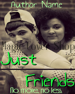
Okay, so I had this (legal) pic in my legal pic file for quite sometime. I originally downloaded it for one of my requests in Magic Cover Shop on Figment. But I found a better one and decided not to use this. It's a nice pic, just I had no idea what to do with it, you know? These people, in my opinion, didn't look like a couple. More like friends. Hence the title "Just Friends" and the subtitle "No more, no less." Perhaps someone can wield a story about two very good male and female friends who each have their own love interests outside their friendship. But in the end, the friendship never dies. Kind of like the happy-ending version of the Friend Zone, I suppose. The reason, the fonts are green...I had spring in mind.


I actually really like how this came out. I'm not gonna lie. You might be able to see that the frosted tree branches fade out in the background. Actually, it's an overlay on top of the one in the "front", or more clearer version. It just appeared very nicely in the back without being so visible on the original pic. So I flipped it and faded it so that it looked as natural as possible, adding depth to the cover. The word "Frostbite" has both a gray title and a light blue title. "Dusk" has a very light orange title and a gray title. "at" is just black faded. The Author Name is "Friandise NormalDemo" black and faded and the Title is "Poor Richard" also faded and overlayed...it might have been lightened...I don't really remember since I did make these a while back. The banners behind are both white faded. I also put a lot of filters on the original pic (legal). Some Cross Process and I think I put some black and white fade on it. If you use PicMonkey, you know what I'm talking about. I think I also added a teeny bit of Dusk effect, as well. Idk what you can get out of this but maybe someone can get something out of it.